


Triangle Group specializes in the complex equipping in Retail&HoReCa segment such as outlets and public catering. If you're looking for a powerful and energy-efficient refrigerator for your catering establishment Trngl Group managers will take care of that.
Goals
The client already had a website, the main goals were:
- Update the website since the old one felt outdated; Create the corporate style; Lay out the information about product and services in convenient way;
- Creat the online representation: ability to post news, articles and get feedback from the users;
- Optimize the website and make sure it behaves well under high load.
Solution
We made a range of solutions for the client. For instance we've designed a new catalogue structure which made the search more friendly, added the news page and offered new design ideas to underline existing corporate style and increase the overall usability of the website.
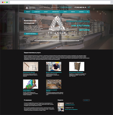
Old version
After investigation we noted many problems such as:
- It was extremely hard to efficiently user the catalogue. There was no search field or filter.
- The product page was not informative and not visual enough.
- The design of the homepage was moldy even though it wasn't that bad in terms of color design.
- The layout of the pages was outdated as well.
Since the website is a commercial project the problems damaged the conversion and sales.
New Design
The new design we made for Triangle used a modern approach. It became modern and friendly. We have managed to preserve the corporate style and simultaneously improve the stucture. We placed the content in such manner that it's convenient to browse through.
The new design we made for Triangle used a modern approach. It became modern and friendly. We have managed to preserve the corporate style and simultaneously improve the stucture. We placed the content in such manner that it's convenient to browser through. The main difference between the new and old websites is that we put focus on the brand.
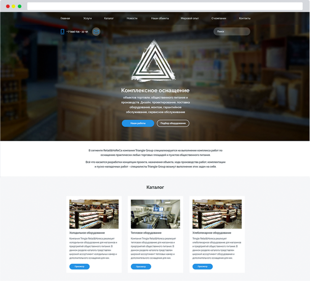
Colors
The design utilizes corporate colors: white, red and black. They get along well with each other and underline the corporate style.
Font
A great UI font “Raleway”
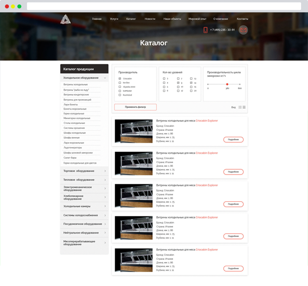
Reworking the catalogue
Increasing Usability
The catalogue has been reworked according to the modern standards.
We introduced a convenient filter and a category map. We also gave the user a choice for product view: the open view that has a lot of information and collapsed which could be used if there are too many products.
A search field has been developed and each product in the catalogue now has its' own page with a gallery that the administrator can fill up with images.
New Services Page
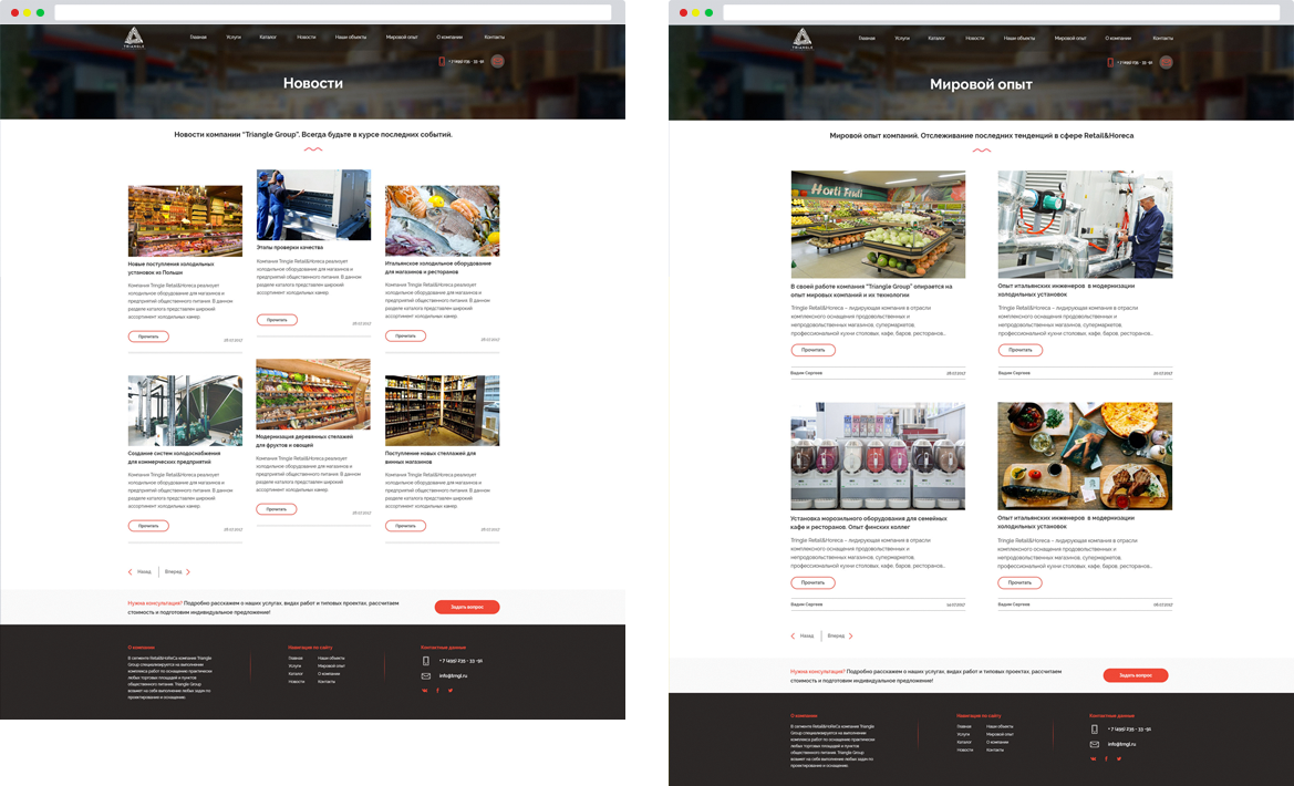
Страница услуги получила очень красивый и современный дизайн. Сочные изображения с названием услуги, здорово вписывается в концепцию сайта и очень понравился клиенту как элемент визуализации информации. Плиточный дизайн создает аккуратный внешний вид сайта. Это очень удобный и простой вид дизайна, и является очень хорошим решением для адаптивности.
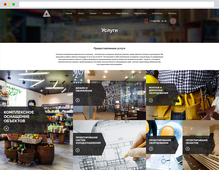
More visual content!
Work with images plays important role in the design of modern website. Visual content makes websites more attractive. We've put a lot of attention to the visual content while we were working with "Triangle". Vibrant images is a better choice than tons of plain text articles that no one would read.
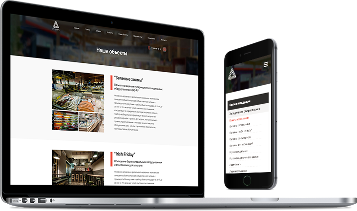
Responsive Design
The website is now cross-platform. We've introduced the mobile version for phones and tablets.
Since the number of mobile devices increased drastically over the last few yeas responsive design is crucial.
Our statistics say that over 50% of user traffic comes form mobile devices.
Results
The website turned out very stylish. We've managed to increase usability and user experience. The project now has better place in search engines and it's reflected on the sales soon after the release.